Part 1: Animation, Visuals, and Character design
Animation

Despite years between them, the animation in Sonic Underground and Sat Am are relatively similar. They were both made by the same company, DiC Entertainment (as well as AoStH). They both have common errors, as well as shared traits (like Sonic's feet turning into a ball as he runs). I'd have to say that music and running effects are a bit brighter and eye-catching, though, allowing Underground the win (barely).
Visuals

To match it's "darker" theme, Sat Am was accompanied by darker shades and hues than AoStH. Many of the settings are combinations of deep browns, greens, blues, and grays. There's something about it, though, that just seems very nineties-ish.
In the Archie comics, which had some of the same characters and locations, would notably lighten the designs over time.
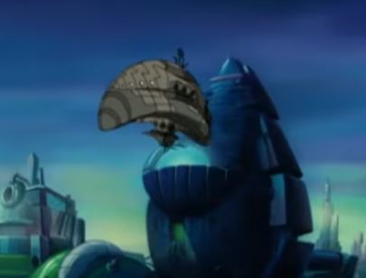
Underground, by contrast, chooses lighter tones than either of the previous (but not as light as the OVA). While Robotropolis is similar to on Sat AM, other locations varied with colors. Brighter scenes for sunny and desert-like locations, greens and grays in the grittier parts of cities. Everything looks a bit clearer, too.
The Sat Am technique was an interesting style, but I don't think it's aged as well.
Character Design
Sonic

Although I do prefer Sonic's darker blue, the Underground version took the design a bit closer to the games (I once heard that this was requested by Sega of Japan, but I'm not 100%). For one thing, his "mohawk" style that had been dominate previously was replaced with multiples "3-D" layers of spikes like in the games. He also has 5 fingers instead of the cartoon-ish 4 like in Sat Am. However, due to the cheap animation, the changes are not obvious.

His eyelids are actually blue, which is ahead of it's time (sort of) as modern Sonic's eyelids were, too. Sat Am's opening shows Sonic winking...and his eyelid is white. I don't recall if that was permanent, but since it was always in the opening it was a reoccurring error.
Robotnik
The design is almost identical. There are slight changes a fan would notice, but I don't like either. While trying to make the character more menacing, both seem to forget what the character looked like in the original game. The thin mustache may bother me the most.
Other Sat Am characters

Some of the freedom fighters have interesting designs. Bunnie's was ahead of her time (similar to both Cream and Rouge). The robotic parts were an intriguing element.
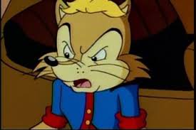
Sally's design always screamed 90s to me; the big artificial-red hair and later the (denim?!) jacket. I wished her head was more similar to Sonic's--as a chipmunk her mouth/nose is brought forward and it looks a bit awkward. Didn't age as well but it was alright (and with a few tweaks she fit right in). As far as her being "nude" it didn't seem like a big deal since she had a simple/young design (but with some of the takes in the comics and plus the direction fan art seemed to head, I defiantly understand her late-comic redesign).
Antoine's design disgusted me. It doesn't match the Sonic-style (and why give this guy a hefty shirt but leave Sally out in the cold?). I guess maybe it's trying to add to the character's background or maybe just make him look wimpy, but I'm not a fan of how bulky it is. His face has the "Sally nose" problem as well.
Rotor's generally tubby and unappealing. Just doesn't fit with the rest of the cast. Decluy is the worst because she's large and embarrassing. She looks straight out of Dragon Tales, and doesn't have many defining traits. I like Uncle Chuck, but he doesn't look that different from Sonic. Conversely, Sally's dad is oddly a different species (than her)?

Snivley's pretty ugly and aside from being almost-bald, he shares little with his uncle's appearance. While his pointy nose is amusing, when combined with his small height and gray skin it's hard to remember he's actually a human. Nagus was very ugly and lame in design. Swatbots were large and menacing, and some other the robots were (others silly), but there was little drawn from the actual genesis hits.
 |
| oh no |
Guest characters were often animals of some kind, but I think they should have been more cartoonish. A horse-dude really sticks out in my mind as ridiculous. While some had clothes, it wasn't uncommon for them to appear awkwardly bare. One character, Lupe, had a cool design, but no one else stands out.
Other Underground Characters

Sonia's design is awesome, except her hair's still a little big. Almost a visual combo of Sally and (classic) Amy, she expresses her girly-girly yet tom-boy personality even in her clothes and style. I like the color scheme, and she also switches with different outfits in the show (the triplets would also wear different disguises). It kind of liked this because as a kid it would always bother me when cartoon characters would wear the same thing (plus I liked "pretty" stuff).
Manic's didn't age as well. I'm okay with the basics of his designs...spikes that may have been an extreme take on Tail's bangs, the red (kinda' reminded me of Sally) jacket. But the earrings and fanny-pack ware clearly a thing of the past.
I loved Queen Aleena's design--but the red coat and detailed-white dress not the big, mint-colored disguise. Aleena resembles her son but is clearly different (looking at you, Bernie), and taller, too.

Sleet and Dingo are extremely ugly and unappealing. The skull thing on Sleet and Dingo's shape-shifting abilities are interesting, but they're so nasty. The Oracle of Delphis is also strange in appearance, but not as bad. Swatbots are now red and purple, which takes away some of their credibility. Once again, the (bigger) robot designs go either way.
 |
| Bartleby |
Guest characters would sort-of resemble animals. Mindy La Tor, for example, had a fox's tail, but had some human-ish elements. Cyrus is definitely a lion, but not everyone was so clear. Many background characters were also alien-ish, further confirming Mobius as an alien planet.
So...
Underground was definitely better with their main characters. Honestly Sat Am throws a close battle, but they just did not age as well. Neither shows are good with guest characters, but it comes down to strange vs awkward...Underground.
In Total
On one hand, it's not a fair fight. Sonic Underground came out years later. On the other, they're both made by DiC and it's a miracle there was any change at all. The art of the Sonic the Hedgehog cartoon was not bad, but Underground was a clear improvement.
No comments:
Post a Comment