Summary
Sega's attempt to recreate their 90s success fell flat.
Visuals/Graphics
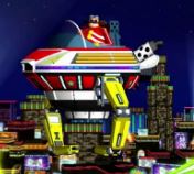
The graphics are beautiful. Years later, and they still hold up. The character's designs look well and expressive. The colors are bright and the cartoonish route seemed to help it age better than other games.
Level Design, Special Stages, Boss Battles
The levels are unoriginal.
- Each one is a rip-off.
- Splash Hill is possibly the worst of them, being too similar for yet another "hill" first level.
- This was suppose to be in honor of the old games, but at that rate they should have just used the same locations (like Generations later did).
There is a fine line between inspiring and copying. For the most part the designs are not that original, and when they are is it's annoying, like the torch/switches in Lost Labyrinth Zone.
The Special Stages look similar to that of Sonic 1, only there is no control over Sonic. Instead the player moves the area around and tries to unlock barriers in a certain amount of time. It's one of the more irritating Special Stages in the Sonic series; I'd much prefer the easier, original version in Sonic 1.
The boss battles are not very original either. The Lost Labyrinth one is the worst because it takes a long time, and--with crushers-- it can easily kill the character regardless of rings. The battles are a slow nuisance.
Gameplay
2D, it plays similar to a classic game, mainly with the addition of the homing attack. I don't really mind the homing attack, but if I wanted a "3D era move" in 2D, I'd prefer the light dash (it would fit better).
The main problem I have is how slow Sonic is. This is defiantly one of his slowest appearances. Kind of the opposite of Sonic Rush's fast, zoom-though gameplay, Sonic takes his good ol' time. It takes him a good while to reach max speed.
Story
I didn't even realize this game had a plot, but apparently Sonic was "taking a break" and Eggman showed up. Kinda' lame excuse, especially since there's nothing to support it.
Music
It's okay, but for a Sonic game it's not very memorable. It seems kinda' loud and mix-matched at points. And there's something about Splash Hill's that either makes me cringe or laugh.
Final Thoughts
- I think that they should have either made this a modern game (set before Sonic Colors instead of Sonic Adventure) or gone full Genesis-mode and made Sonic 16-bit (which eventually happened with Sonic Mania).
- I don't like it being "Sonic 4." It's too close chronologically to the classics, and he looks too much like his modern self.
- A "transitional" design would have been a bit more acceptable.
- It's too boring and slow for a "main console" game. I think I'd be more accepting of it as a handheld.
- I think the Rush and Advance series are better examples of Mod Sonic in 2D.
- I hear Ep 2 is better, but I guess they shouldn't have split it up.
- Still, it's style makes it a good intro-title for those new to the series.
Final Ranking (S is best, E is worst): C
Disappointing. I want to like it, and there's not that much "wrong" with it. It's just kinda' a waste of potential.


No comments:
Post a Comment